
Launching a new business is exciting, but customers form an opinion about your company within seconds of seeing your logo, storefront, or website. If that first impression feels unfinished or inconsistent, even a great product can struggle to earn trust. Building a professional brand identity isn’t about flashy design tricks; it’s about making sure every touchpoint tells the same believable story about who you are. This guide walks through the practical, often overlooked pieces of brand building that help new companies look established from day one.
Why First Impressions Start Long Before You Open
Most new business owners assume branding begins with a logo, but customers are actually forming impressions from the first ad, sign, or social post they see, sometimes weeks before opening day. A “coming soon” banner, a construction sign with a phone number, or a single Instagram teaser can all become someone’s first data point about whether a company feels credible. Research on first impressions suggests people form an opinion within seconds, which means a blurry logo or mismatched color scheme can do damage long before a customer ever walks through the door.
A disjointed rollout, where the website looks different from the signage, which looks different from the social media, creates subconscious doubt about whether a business is legitimate. If the Facebook page uses a different font and color palette than the storefront sign, or the email confirmations look nothing like the branded truck parked outside, customers start wondering if they’re dealing with a real, established company or something thrown together overnight. Even small mismatches, like an outdated phone number on Google listings or inconsistent business hours across platforms, chip away at that sense of reliability.
Consistency across every early touchpoint signals stability, even if the company itself is brand new. This means locking in core brand elements- logo, color palette, typography, and tone of voice- before any public-facing material goes out, whether that’s a permit sign, a hiring flyer, or a pre-launch landing page. Startups that map out every touchpoint in advance, from vehicle wraps to email signatures, tend to look more established on day one than competitors who have been operating for years but never unified their visual identity.
Before spending money on individual materials, it helps to define a few fixed elements that will not change: a color palette (usually two primary colors and one or two accents), a logo mark in both full-color and single-color versions, a tone of voice, and a tagline if you use one. These become the anchor for every decision that follows, from packaging to vehicle wraps to email signatures.
Write them down in a simple one-page brand sheet rather than keeping them in your head or scattered across old design files. Include hex codes, font names, and a few example phrases that capture your tone, so anyone you hire later can match it instantly.
Skipping this step often leads to costly redesigns later once inconsistencies pile up — a business card in one blue, a website in another, and a sign painter who has to guess. Fixing that across ten different vendors typically costs far more than the hour it takes to define these basics upfront.
Building a Website That Works as Hard as You Do
For most startups, the website is the first real interaction a potential customer has with the brand, and it needs to load fast, look credible, and clearly explain what the business offers within seconds. Thoughtful website design does more than look attractive; it guides visitors toward a specific action, whether that is calling for a quote, booking online, or filling out a contact form. A cluttered or outdated site can undo the trust built by every other branding effort.
New business owners often underestimate how much mobile users matter, since a large share of local searches happen on phones while people are actively comparing options nearby. A site that is slow to load or hard to navigate on a small screen will lose that visitor to a competitor within moments.
- Keep navigation simple with no more than five or six main menu items
- Make contact information visible on every page, not just a contact tab
- Use real photos of the business rather than generic stock imagery
- Test load speed regularly, since slow sites hurt both trust and search rankings
Making Your Storefront Impossible to Miss
Physical signage remains one of the most cost-effective advertising tools a startup can invest in, since it works around the clock without any ongoing spend. Working with experienced business sign services helps ensure the materials, lighting, and placement comply with local codes while still standing out from the street. A poorly lit or oddly sized sign can make even a well-run business look like an afterthought.
Many new owners search for local sign buyers when they want fast turnaround and someone who understands neighborhood zoning quirks better than a national chain might. Local providers also tend to know which materials hold up against regional weather, which matters far more than it seems until the first storm season hits. Choosing a nearby vendor often means faster repairs down the line too, since a cracked or faded sign left unfixed quietly damages brand credibility.
Turning Your Vehicles Into Moving Billboards
Any startup that relies on vehicles, from delivery vans to service trucks, has a built-in advertising opportunity that many owners overlook until months after launch. A well-branded towing business, for example, can generate steady local recognition simply by driving normal routes, since the vehicle becomes a rolling reminder of the company name and number. Clear, legible lettering and a consistent color scheme matter more than elaborate graphics, since drivers only get a few seconds to read a passing vehicle.
Companies that haul equipment or materials often overlook trailers as branding real estate, even though they are visible for hours at job sites and on highways. Investing in local enclosed trailers with proper wraps not only protects tools and inventory from weather but also keeps the brand visible in places a website never reaches. This is especially useful for startups still building local word of mouth in their first year.
Dressing Your Team for Brand Consistency
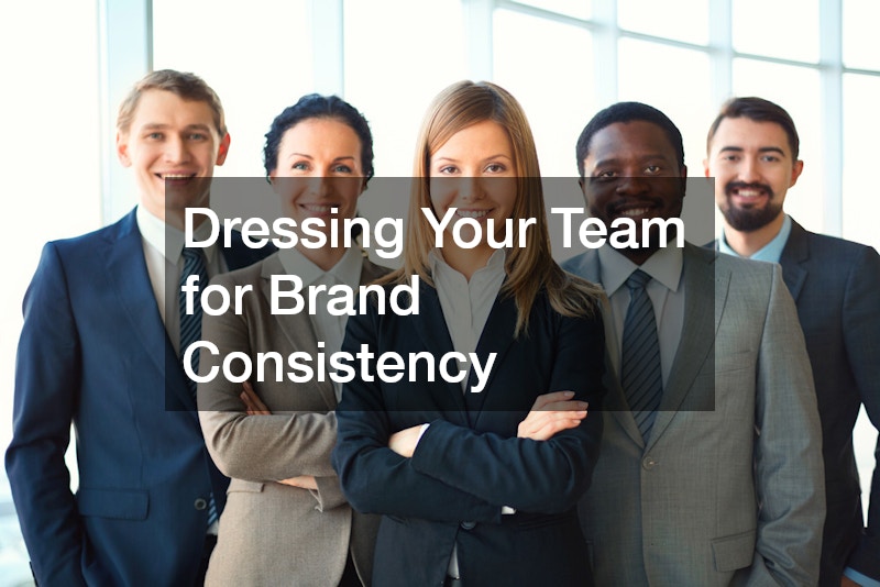
Employee appearance is an underrated branding tool, particularly for startups where staff are often the only face customers ever interact with. Custom embroidery on polos, jackets, or hats gives a business a polished, established look without the higher cost of full uniform programs. It also holds up better over repeated washing than printed logos, which tend to crack or fade within a season.
- Choose two or three garment styles rather than a full catalog to keep costs predictable
- Match thread colors closely to your brand palette for a cohesive look
- Order a small buffer of extra sizes for new hires so uniforms stay consistent
- Reorder from the same vendor to keep stitching quality and placement uniform
Shaping Outdoor Spaces That Reflect Your Brand
For businesses with a physical location, the exterior space often gets less attention than the interior, even though it shapes a visitor’s first impression before they ever walk through the door. Many retail and hospitality startups work with awning companies to add shade, protect signage from sun damage, and create a distinct visual identity visible from the street. A well-chosen awning color and shape can make a small storefront feel far more established than its size suggests.
Outdoor seating or patio areas are becoming more common even for smaller businesses, and automated pergolas offer a flexible way to extend usable space without a full construction project. These systems can open or close based on weather, which keeps outdoor branding elements like signage and furniture protected year-round. For startups in food service or wellness industries, this kind of outdoor investment often pays off through increased dwell time and social media visibility.
Keeping Renovation and Buildout Projects Tidy
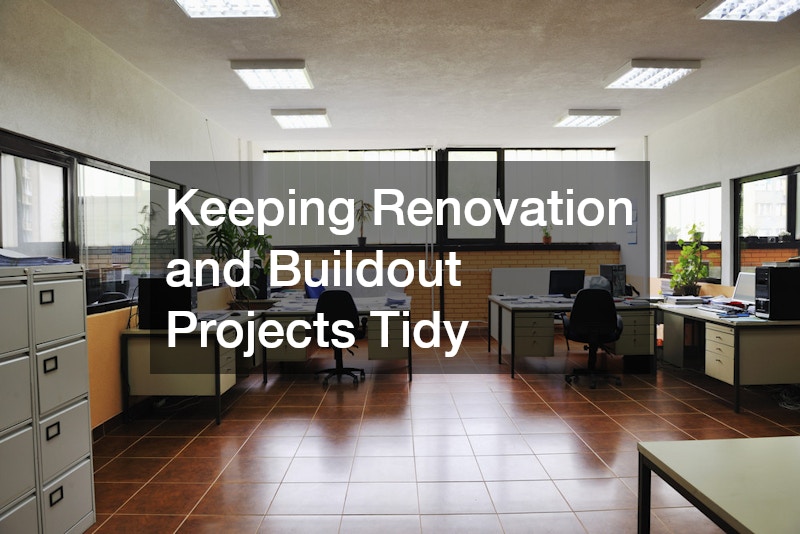
Startups renovating a retail space, office, or warehouse before opening often underestimate how much debris a buildout generates, and a messy job site can quietly damage first impressions with neighbors, inspectors, or early customers walking by. Arranging a roll off dumpster rental ahead of time keeps construction debris contained and the property looking managed rather than chaotic during the weeks before launch. This is a small logistical detail, but it affects how seriously local officials and future customers take the business before it even opens.
Timing the rental around key phases of construction, such as demolition and final cleanup, prevents unnecessary extra hauls and keeps the project on budget. Coordinating with contractors on size needs upfront avoids the common mistake of ordering a bin too small for the job.
Reaching the Right Customers With Smarter Marketing Tools
Once the visual identity is in place, startups still need a strategy for getting discovered by the right local audience, and this is where marketing technology has changed significantly in recent years. Predictive analytics, machine learning models, and real-time trend tracking now allow even small teams to make marketing decisions that once required a full research department.
Some tourism-focused and hospitality startups are now experimenting with ai for destination marketing tools that analyze traveler search patterns, booking data, and social trends to predict which locations and seasons will draw the most visitors. A regional bed-and-breakfast network, for example, might use these tools to spot a spike in searches for “quiet weekend getaways” three months before peak season and adjust ad spend accordingly.
Even businesses outside travel can borrow this thinking by using data-driven tools to figure out when and where their ideal customer is most active online. A local fitness studio might discover that potential clients search for classes on Sunday evenings, while a boutique consulting firm might find its best leads come from LinkedIn discussions rather than paid search.
The key consideration for any startup is choosing tools that match the size of the business. A five-person team doesn’t need enterprise-level software with a six-figure price tag; often a modest analytics platform paired with careful attention to timing, keywords, and audience behavior delivers similar clarity at a fraction of the cost.
The key is not adopting every new tool available, but choosing the ones that match the business model and customer base. A small local shop rarely needs the same marketing stack as a regional travel brand, so it pays to start simple and add complexity only when the data justifies it.
Three questions can help narrow the choice: Where do target customers already spend their time? What does the team have the bandwidth to maintain consistently? And which metrics, like open rates, foot traffic, or repeat purchases, actually indicate progress? Answering these before purchasing anything prevents tool fatigue and keeps marketing spend tied to real growth rather than trends.
Tying Every Piece Together Into One Cohesive Identity
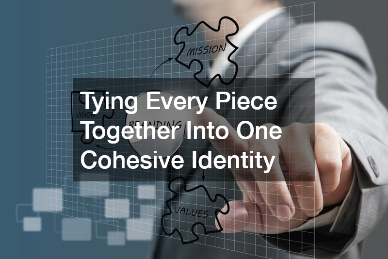
The real test of a brand identity is whether a customer would recognize the business the same way across a website, a storefront sign, a work uniform, or a service vehicle. Startups that treat each of these as separate projects instead of one connected system often end up with a fragmented look that undercuts the credibility they worked hard to build. A mismatched logo on a delivery van or a different shade of blue on packaging than on the app icon might seem minor, but these small inconsistencies add up to a brand that feels amateurish or untrustworthy.
A simple brand style guide, even a one-page document listing colors, fonts, and logo usage rules, keeps every vendor and employee aligned. This guide should specify exact color codes (HEX, RGB, and CMYK values, since print and digital use different formats), approved font families for headlines versus body text, and logo spacing or minimum-size rules so it never gets stretched or cropped awkwardly. It’s also worth including a few “don’ts,” such as never placing the logo on a busy background or altering its proportions, since people often need explicit examples of what to avoid.
Beyond the visuals, the guide should touch on tone of voice: is the brand playful and casual, or precise and authoritative? This matters just as much for consistency, since a witty Instagram caption paired with a stiff, jargon-heavy website creates the same disjointed feeling as mismatched colors. Sharing this document with every designer, printer, contractor, and new hire from day one prevents small deviations from piling up into a brand that looks like it was assembled by five different companies.
Revisiting this guide every six to twelve months during the early growth phase helps catch inconsistencies before they spread across dozens of materials. Small businesses that stay disciplined about this tend to look far more established than their actual size or age would suggest.
A strong brand identity is built through dozens of small, consistent decisions rather than one big design project. From the website a customer visits first to the sign they see driving past, every detail either reinforces or undermines the trust a new business is trying to earn. Start with the fundamentals covered here, tackle one piece at a time, and revisit your brand guide regularly as the business grows. The effort pays off in customers who recognize, trust, and return to a brand that looks like it knows exactly what it’s doing.